Case Study
Safe Haven Therapy: volunteer project
Timeline: October 31st- December 2nd, 2024
Role: Stakeholder interviews, branding, design brief, persona, user testing, tree testing, IA redesign, heuristic evaluation, wireframes
Intro
The website for Safe Haven Therapy serves as a resource hub for current and potential clients, offering easy access to information and a way to connect and schedule services with the therapist.
The goals of the project
Website is easy to navigate
Growth in potential clients reaching out and scheduling appointments
Accessible, visually cohesive design system that aligns with the brands identity
Current challenges
High Competition:
The website must include unique positioning and emphasize the lived experience that sets Safe Haven Therapy apart.
The current website design is visually disjointed
Key information is buried and user path is not intuitive
Empathizing with the user
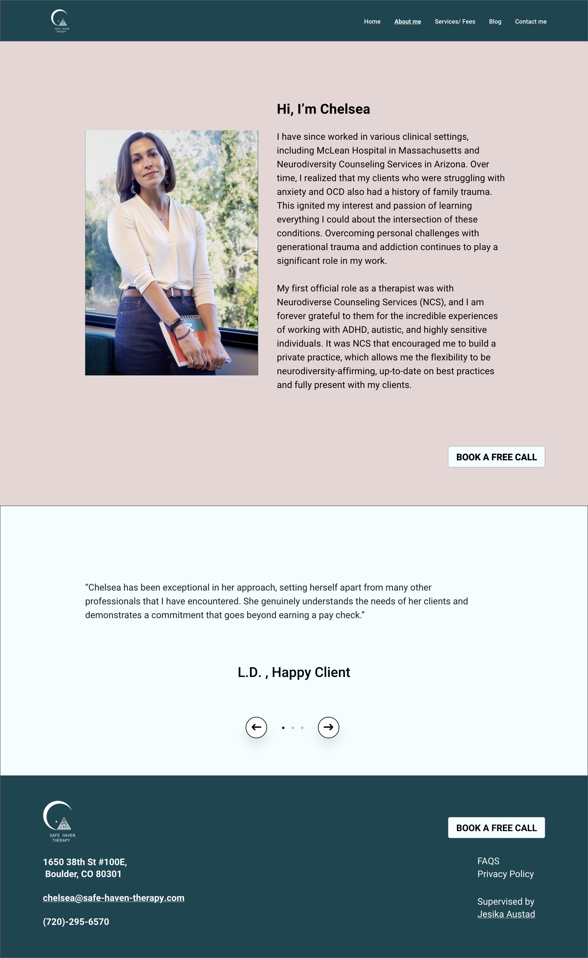
Using stakeholder interviews, I crafted a vision statement: “Safe Haven Therapy is a mental health practice designed to empower individuals facing anxiety, OCD, and developmental/family trauma. Safe Haven Therapy emphasizes neurodiversity-affirming care that is grounded in both clinical expertise and lived experience.
We needed to:
Employ user-centric design by ensuring the website is intuitive, simple, and easy to navigate
Prioritize content and features to support the user’s primary goal
Set practice apart from competitors by emphasizing areas of expertise and establishing trust by positioning therapy practice as safe, compassionate, and knowledgeable
Eliminate distracting features such as animations
Heuristic evaluation
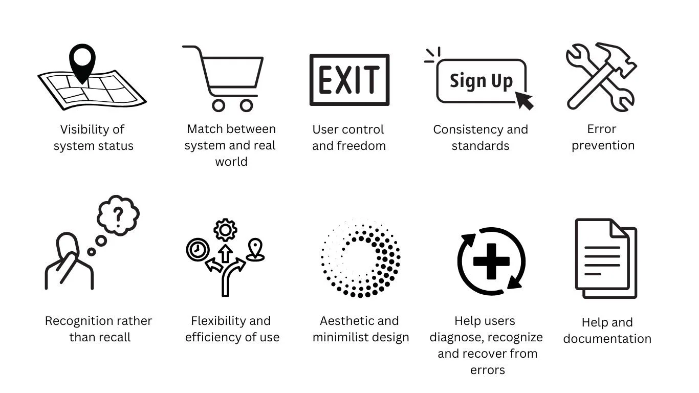
Using Jakob Nielsen's 10 general principles for interaction design, I encountered some violations.
Violations
Consistency and Standards
Call to action buttons had no size consistency, as well as up to three different labels on the homepage alone.
Website had no visual continuity from page to page.
When users encounter consistent navigation menus, category labels, and overall site structure across different sections, they can easily understand where they are and how to access information, which is a core principle of good IA.
User comments
Recognition rather than recall
Information was placed in individual categories, instead of grouping ‘like” information. This could cause confusion and decrease the efficiency of the site.
Analysis of ten other competitor’s websites revealed that, the Safe Haven site did not follow industry information architecture standards. By changing the format that users expect on this type of site, you essentially make them work harder than necessary to complete a task.
User comments
Every extra unit of information in an interface competes with the relevant units of information and diminishes their relative visibility.
Aesthetic and Minimalistic Design
Options are buried deep within a page.
Huge, uninterrupted blocks of text visually overwhelm the user.
User comments
Tree testing
Based on user comments, competitive analysis and heuristic violations, a content audit was conducted. I then consolidated categories and designed a new, simplified framework that prioritized content for the core user objectives.
Three users who self identified as neurodiverse, were able to successfully complete the following five actions without any backtracking.
Find out what other clients are saying about their experience with the therapist
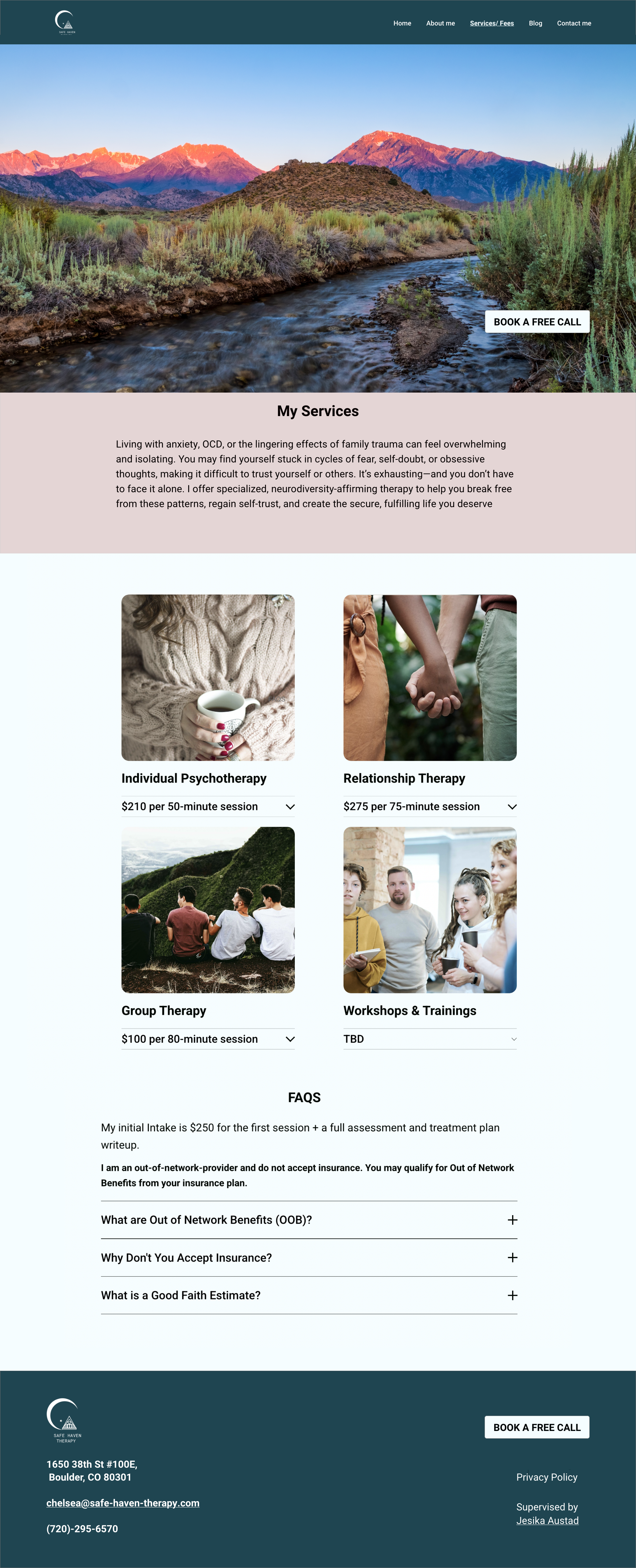
Find out about what type of therapy this practice offers
See how much individual therapy will cost
Reach out to the therapist to set up an intake appointment
Find out if this practice takes United insurance
Solutions
Establish visual consistency
Prioritize content and features to support the user’s primary goal
Create consistent call to action buttons across all pages
Define a design system; ample white space, clear color branding
Simplify navigation
Prioritize key content
Consolidate categories and create clear pathways
Use well-known, tested design patterns like grid layout and card designs & hide large bodies of text behind buttons to eliminate distractions
Focus on usability and accessibility
Simplify Interactions: Minimize the number of steps required for users to complete key tasks & remove any unnecessary distractions.
Simplify contact form and make it error proof
eliminate contrast errors and choose highly legible typography
Lessons learned
Always take screenshots as you evaluate a product. In between the time that I did stakeholder interviews and wrote my design brief, most of the site was inadvertently deleted by the website developer (the owner of Safe Haven).
I did a deep dive into best practices for interfaces designed for neurodiverse users. Research shows that designs that are parred down, simplified, and free from visual chaos are the most usable for this population. Coincidentally, all these practices make products more intuitive for all users, proving again, that making inclusive designs benefits everyone.
“It's that inclusive design becomes the only way to design, so that my job as an inclusive designer is just a designer.”
-Christina Mallon, Microsoft’s head of inclusive design
What the critics say
“Hannah was so enjoyable to work with. She was efficient, thoughtful, and truly dedicated to making my vision of a streamlined and welcoming website come true. As someone who often works with neurodivergent clients, I really needed someone who understood website accessibility. Hannah ensured that everything from font and color palette to internal website links were created with my ideal client in mind. I get regular compliments on how warm and welcoming my website is. I would highly recommend Hannah for your website needs.”
— Chelsea, owner of Safe Haven Therapy


