Intro
The website for CUPresents.org serves as an online platform for promoting and selling tickets for performing arts events hosted by the University of Colorado, Boulder. Stakeholder interviews suggest some dissatisfaction among users, but complaints lacked specificity.
Case Study
CUPresents Mobile App: final project for UX Metrics
Timeline: February 27th- March 10th, 2024
Role: user research, compiled analytics, conducted usability testing, and prototype
The goals
Encourage repeat visits and lead to higher sales.
Identify design concerns to be addressed in order to improve end-user satisfaction and reduce drop off rates.
Why focus on the mobile version?
According to Google Analytics for CUPresents.org, in a 28 day span during the study, there were 32,790 total visitors to the site. Of those users, 21,640 used a mobile device to access the site. Only 506 of those mobile users completed a transaction! This means that the majority of traffic is through mobile devices, but mobile users were not making many conversions.
The usability tasks were derived from test scenarios developed from recurring user ratings, complaints and comments. Since the majority of users access the mobile site, testing will focus on this interface.
Due to the range of functionality provided in the application, and the short time each participant was available, the tasks were the most common and relatively complex of available functions. The tasks were identical for all participants in the study.
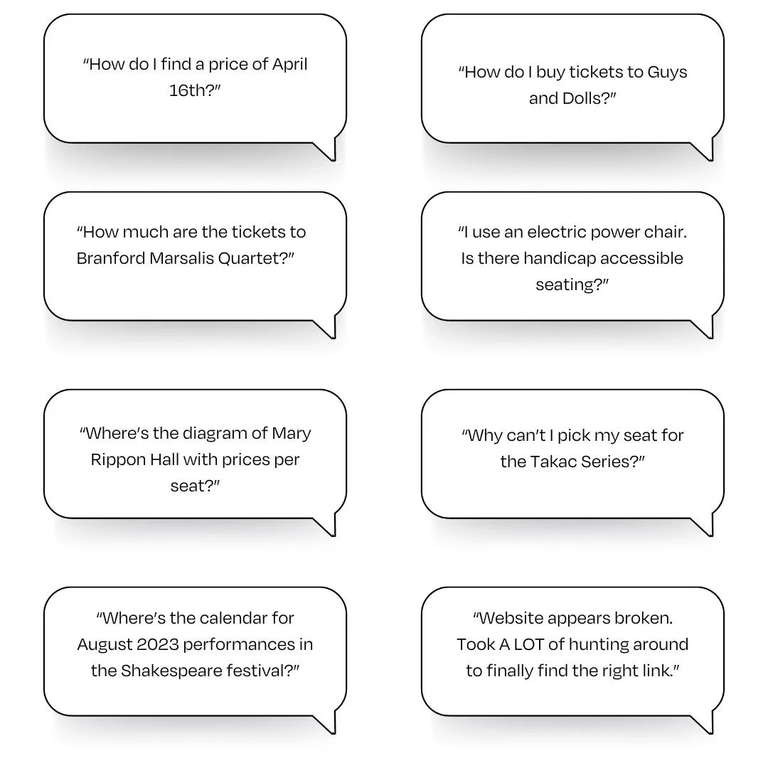
Problems reported to customer service
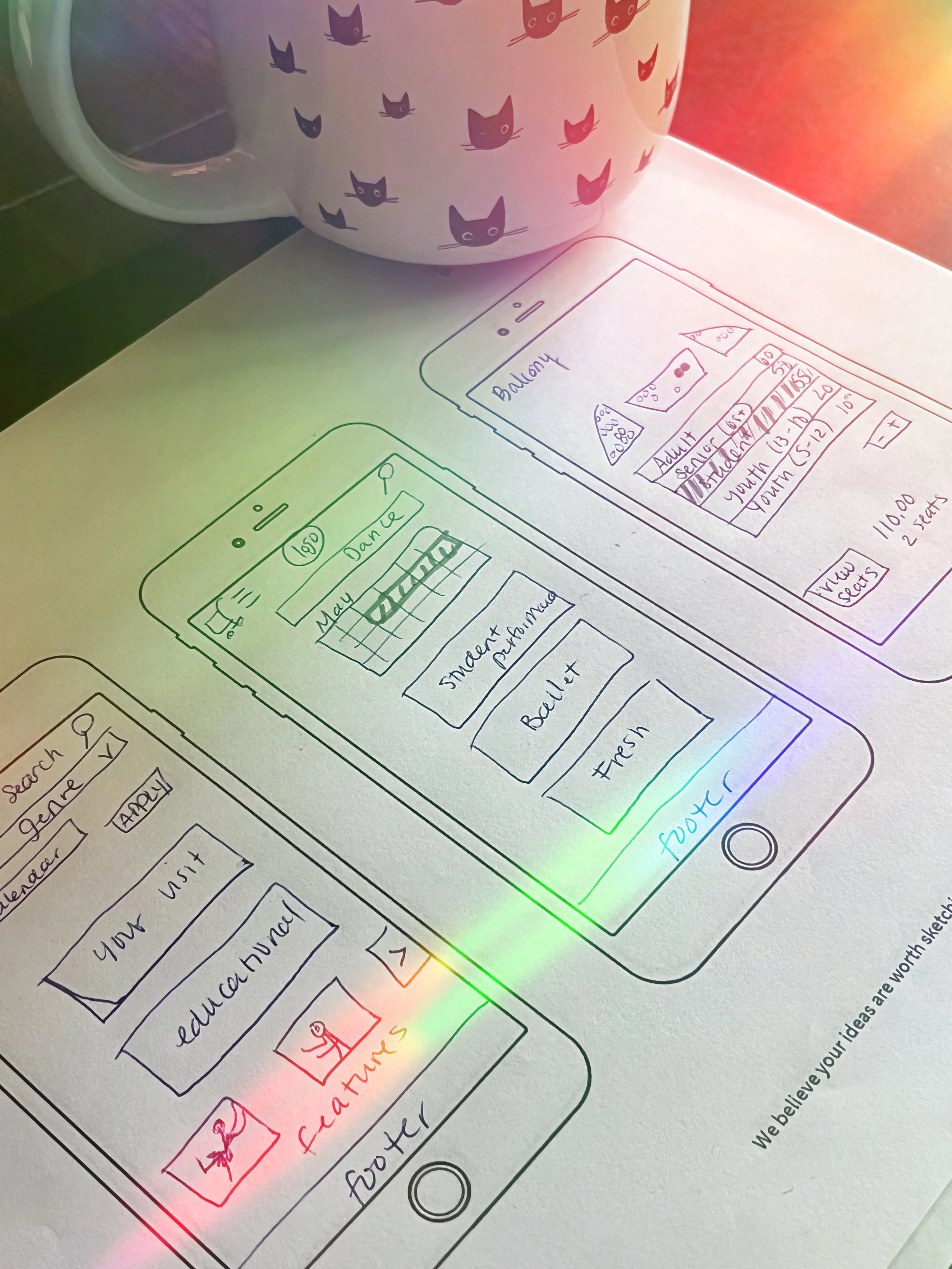
Define * Ideate * Design
User test
Based on the types of user complaints, I focused my testing on whether users could easily find information through navigation about upcoming events, ticket purchasing options, and venue details. I also focused on if users were able to quickly locate relevant information. Users were not allowed to use the ‘search’ function.
Methodology
The usability test sessions involved eight participants. All of the sessions were moderated and conducted remotely through Google Meet links by me. Tests took approximately 45 minutes or less to complete. Users were recruited through Facebook.
Participants
Participants used their own mobile devices to complete six separate tasks, using a web browser to assess the navigation of the mobile interface. Participants were filtered based on criteria that matched the site’s target audience according to stakeholders in the marketing department (women ages 25-55). All participants had a least some experience buying tickets with a mobile ticketing system.
-
1. You’d like to sign your child up for the Colorado Shakespeare Festival children’s summer camp. Find the page on the site with the date ranges for this event.
2. Your friend’s birthday is in March and they enjoy the theater. Find the March calendar for all theater events.
3. Find the page with the plot description for the Shakespeare play “Arden of Faversham.”
4. Find the link to buy tickets for a dance performance by “The Current” and reserve a seat for an adult ticket.
5. Your friend really enjoys listening to Honky-Tonk and they’d like to see “Asleep at the Wheel.” Find the page with info on how much tickets will cost.
6. Find the page with info on if Grusin Music Hall will allow your service dog.
Participants' satisfaction was assessed through surveys administered after the interaction with the application. Additionally, open-ended questions and ‘think aloud’ protocols were used to gather suggestions for improvement, allowing participants to provide detailed feedback on their experience and any issues encountered during the usability test.
Metrics gathered
Completion Rate: Number of tasks completed without critical errors.
Time on Task: Time taken to complete each task measured from the time the user began the task to when they signal completion.
Subjective Measures: Participants' satisfaction and emotional responses about specific tasks, perceived time to perform each task, features, and functionality.
Data collected through surveys using a Likert scale and moderator observations and interviews during user testing.
Test results
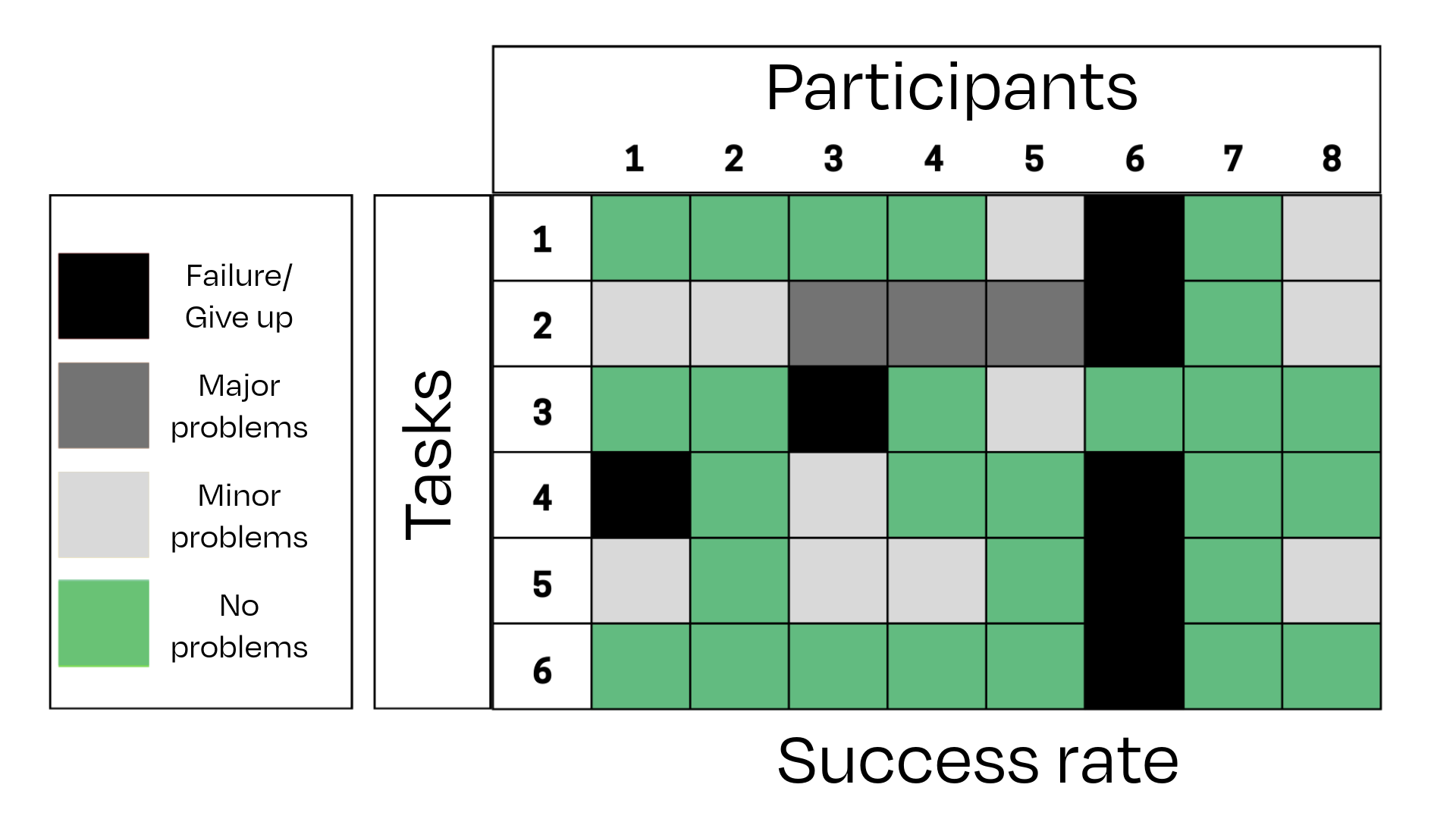
Task completion
Participant six was legally blind and used a screen reader as an accommodation to access the mobile website.
Task completion definitions
-
The user completed the task successfully without difficulty or inefficiency.
-
The user completed the task successfully but took a slight detour. They made one or two small mistakes but recovered quickly.
-
The user completed the task successfully but struggled and took a major detour.
-
The user provided the wrong answer or gave up before completing the task before successful completion.
Time on tasks
Ideal time calculated by non-expert attempting the task using the most direct route and then multiplied by 2 to account for “think aloud” protocols.
Participant six is legally blind and used a screen reader as an accommodation to access the mobile website. Their time-on-tasks scores were not calculated in the average.
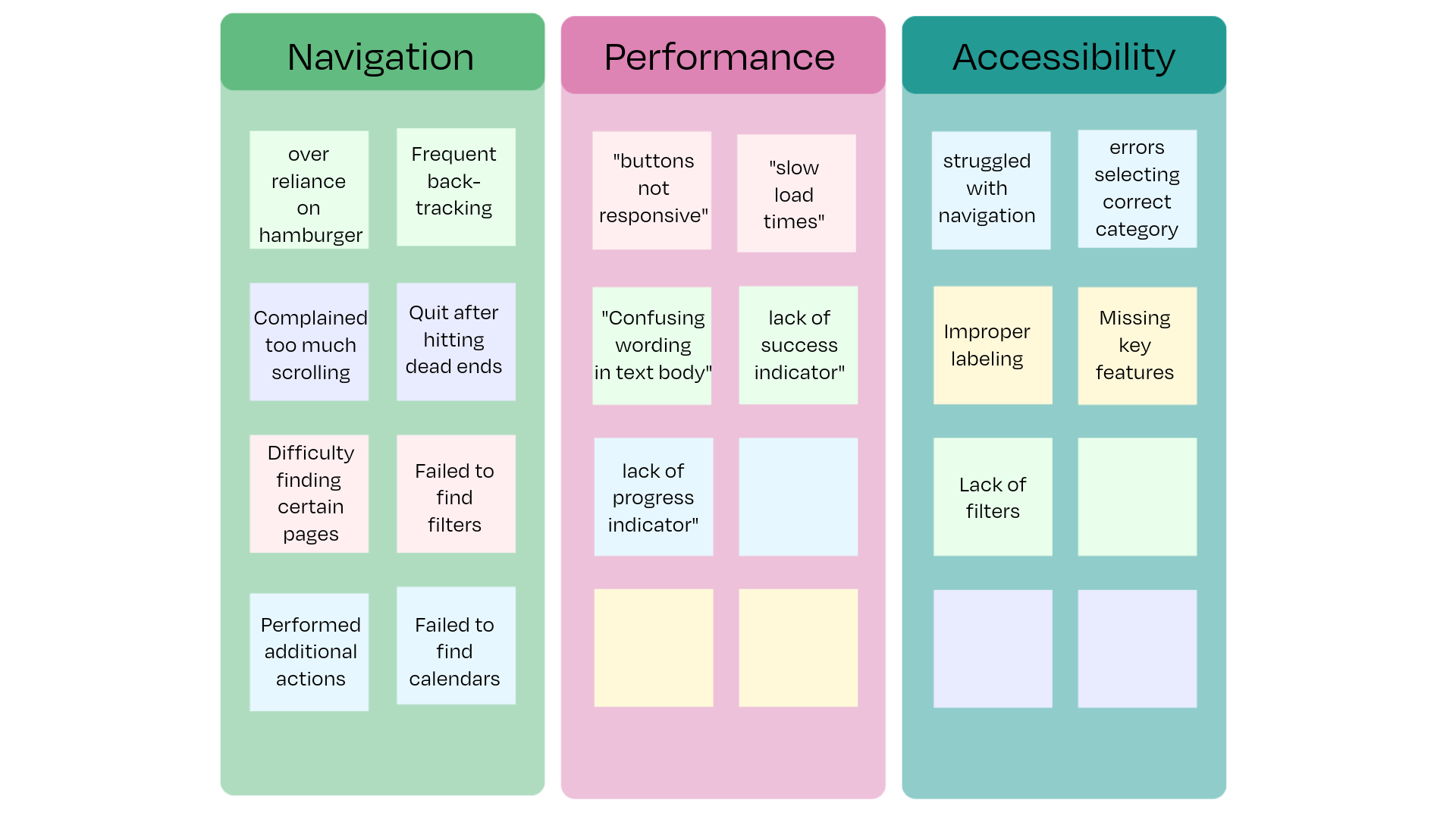
Subjective user comments
Findings
First the positive:
Nice legible font size
The site provided necessary information, albeit with navigation difficulties.
Most participants eventually completed the tasks.
Issues encountered
The complaints overwhelmingly focused on navigation difficulty
A future study should be conducted for an accessibility review
Make the following recommendations to developers:
Address Load Times: to improve site performance
Ensure Button Responsiveness: Fix inconsistencies to provide immediate feedback.
Solutions for navigation issues
Redesign Homepage: Create a navigation hub focused on ticket sales.
Enhance Visibility of Filters and Calendar: Improve design and placement of these features.
Streamline User Actions: Streamline workflows with fewer steps for completing tasks to minimize user effort.
Lessons learned
During recruitment for user testing, I never thought to include screening questions to determine participant’s disability status. I didn’t know how to treat the data I collected and I didn’t know any of the web accessibility guidelines. I have since taken some courses to better understand web and digital accessibility standards.
Accessibility ensures that digital products are usable by everyone, including people with disabilities. By designing with accessibility in mind, we create inclusive experiences that cater to a broader audience, enhancing overall user satisfaction. By prioritizing accessibility, businesses can reach a larger audience, including the estimated one billion people worldwide living with disabilities. Accessible products can foster customer loyalty and positive word-of-mouth, driving long-term success.
“Empathy-driven design leads to more thoughtful and user-centered solutions, ultimately creating better products.”
What the critics say
“Thanks for the effort you put into this! Great to have you in my class. (you got the highest grade in the class - Congrats!)”
— Mark, professor of UX Metrics, UCSD


